Price Action Grid

Pure Price Action: ‘the language of the charts’ speaks only of structure.

As engineers we have performed extensive studies looking at how price interacts with chart structure and have concluded that each aspect of support and resistance can be categorized as follows: –

All of the above combine to form what we have called the ‘Price Action Grid’ which is a key component of our Trading Edge, as explained in detail in the section Putting It all TogetherThe Trade Controller overlays the Price Action Grid, which consists of both higher and lower time frame structure, onto the charts and projects it into the future.

Our approach to Pure Price Action Trading is to observe how price interacts with the Grid to help identify potential high energy, high probability, high value trade setups. This approach enables setups to be anticipated in advance, allowing time for key parameters such as trade entry, stop-loss placement and profit targets to be identified and marked up.

One of the challenges with overlaying both the higher and lower time frame structure onto a single chart was how to do this in a meaningful, helpful way whilst avoiding the chart becoming cluttered and confusing.

Our solution was to:

  • Standardize on colours that compliment each other.
  • Set object visualization properties such that they are displayed only on the required time frames.
  • Lock the Grid objects into position so that they cannot be accidentally moved or deleted.
  • Overlay only the active components of the Grid onto the chart used for trading.
  • Leverage multiple MT4 installs to display copies of the parent chart, easily referencing the higher time frame structure.

To achieve this we developed several custom MT4 modules such that we only have to maintain a single (parent) chart for any given market. If required, the parent chart can be copied to other MT4 installs using the Trade Controller Manage Charts Tool.

Overlaying Horizontal Structure

When studying the charts we observed that price regularly moved between specific horizontal zones that were clearly acting as either support or resistance. We found these zones to be fractal in nature since they appeared on both the higher and lower time frames, and they were of a fixed height and equidistant apart.

We reasoned that since price regularly interacts with these horizontal zones of support and resistance that are fixed and predictable, then it would be advantageous to know about them when trading the markets and to have them displayed on the charts.

Therefore we developed the Key Structure Tool to enable the definition of horizontal reference zones that can be displayed on the charts, overlaid above and below the current price and projected into the future. These horizontal zones can be setup to display on any or all time frames according to user preference and what is most helpful at any given time.

Displaying the horizontal zones in this way provides clear guidance as to whether price is heading into major areas of support or resistance, which is vital information when considering new trade opportunities or managing existing trades, and when defining trade entry, stop-loss and profit target levels.

The screenshots below show examples of the horizontal zones defined for the DAX daily and hourly time frames, with the arrows highlighting the precision of price interaction with them which at times is pip perfect.

DAX Daily Time Frame

DAX Hourly Time Frame

Overlaying Sloping Structure

During our studies we concluded that price movement was not random, it tended to move up and down in fixed amounts and that ‘Price is always being channelled by chart structure’ whether it be horizontal or sloping.

We found that it was generally more difficult to identify sloping structure compared to horizontal structure. With horizontal structure you only need to identify levels but with sloping structure you need to accurately identify the angle of the slope that best fits the price action chart patterns. This not only requires experience, but can be very subjective since people will see different channels when looking at the same chart.

In the same way as with the horizontal structure, we reasoned that it would also be advantageous to display the sloping structure on the charts. So we applied our engineering skillset to design and develop software routines that would analyse the slope of the price action chart patterns to determine the step size and reference values, in order to accurately overlay and project them into the future.

This feature is demonstrated in the screenshots below and described in detail in the Reference Channels Setup and Channels Overlay Feature videos.

H1 DAX REF Bull Channel 01
29th May 2017: Hourly Bull Reference Channel Setup
22nd June 2017: Hourly Bear Reference Channel Setup
H1 DAX REF Bull Channel 02
29th May 2017: Hourly Bull Channels Overlaid
22nd June 2017: Hourly Bear Channels Overlaid

The screenshots below show the DAX hourly time frame on the 16th August 2017, two months on from when the hourly bull and bear reference channels were defined, with the same equidistant bull and bear channels overlaid and projected into the future.

H1 DAX REF Bull Channel 03
16th August 2017: Hourly Bull Channels Overlaid
16th August 2017: Hourly Bear Channels Overlaid

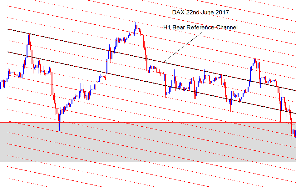
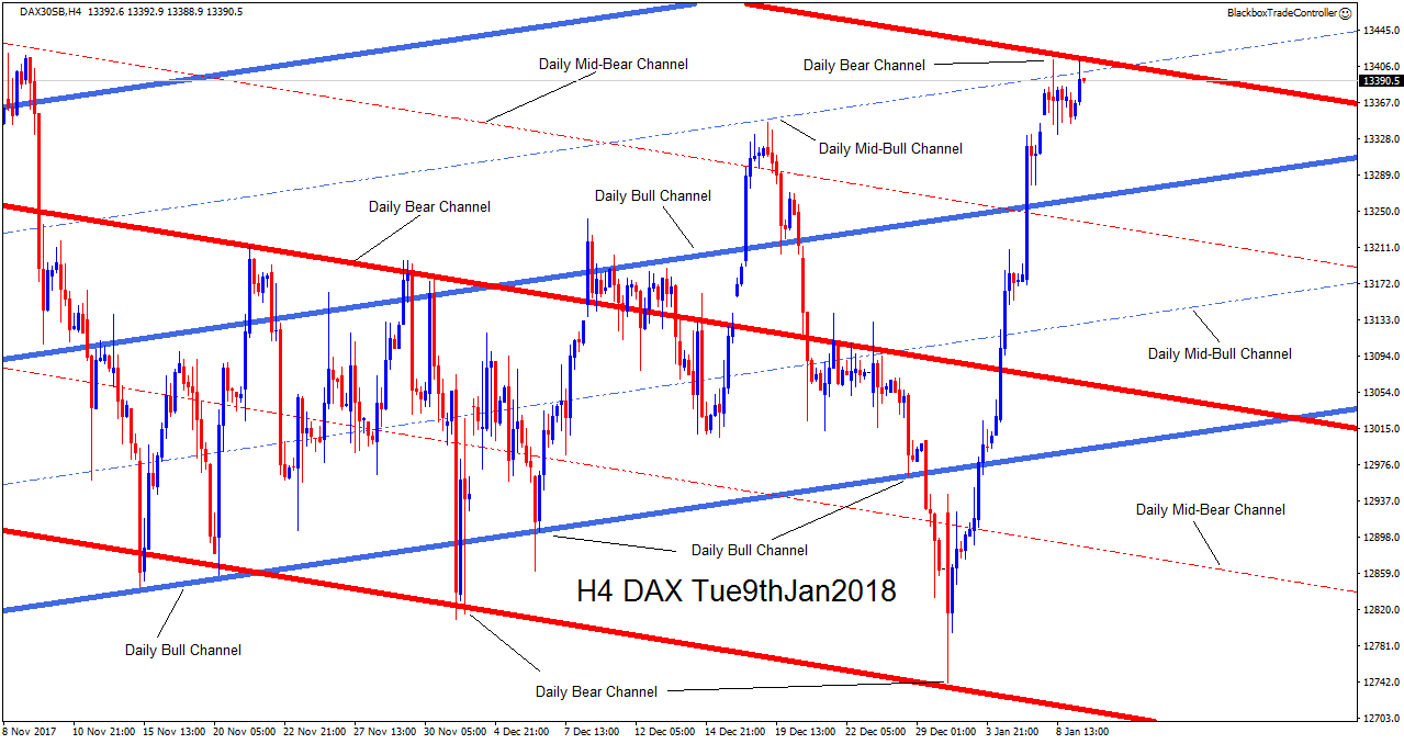
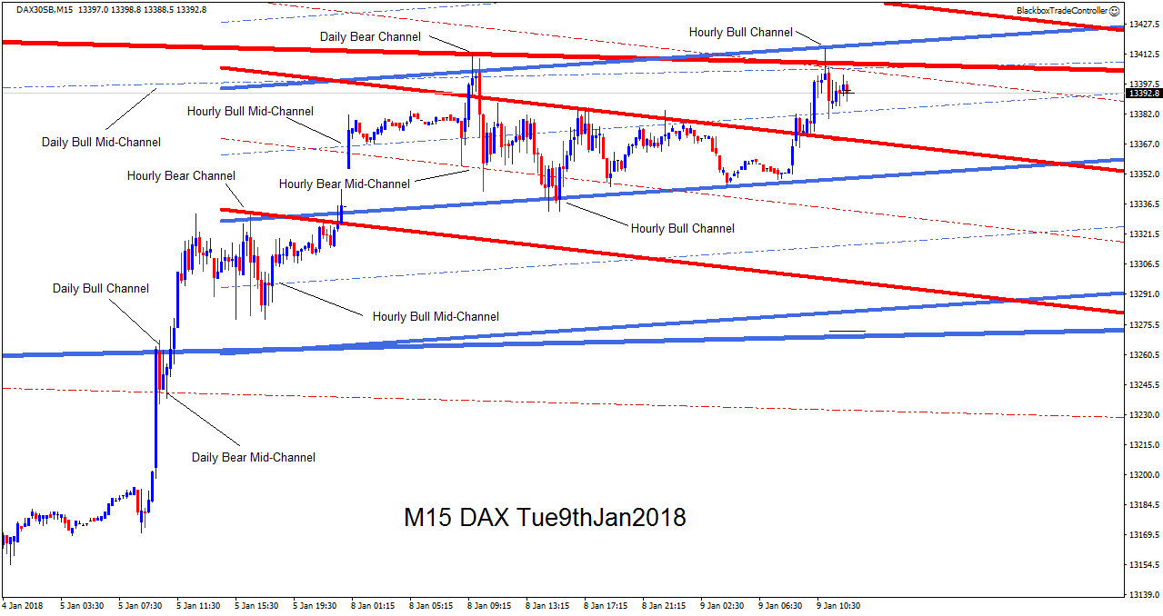
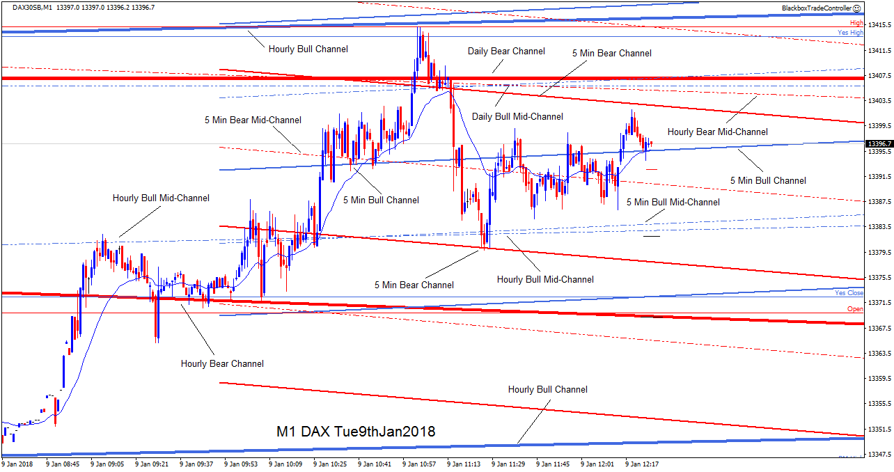
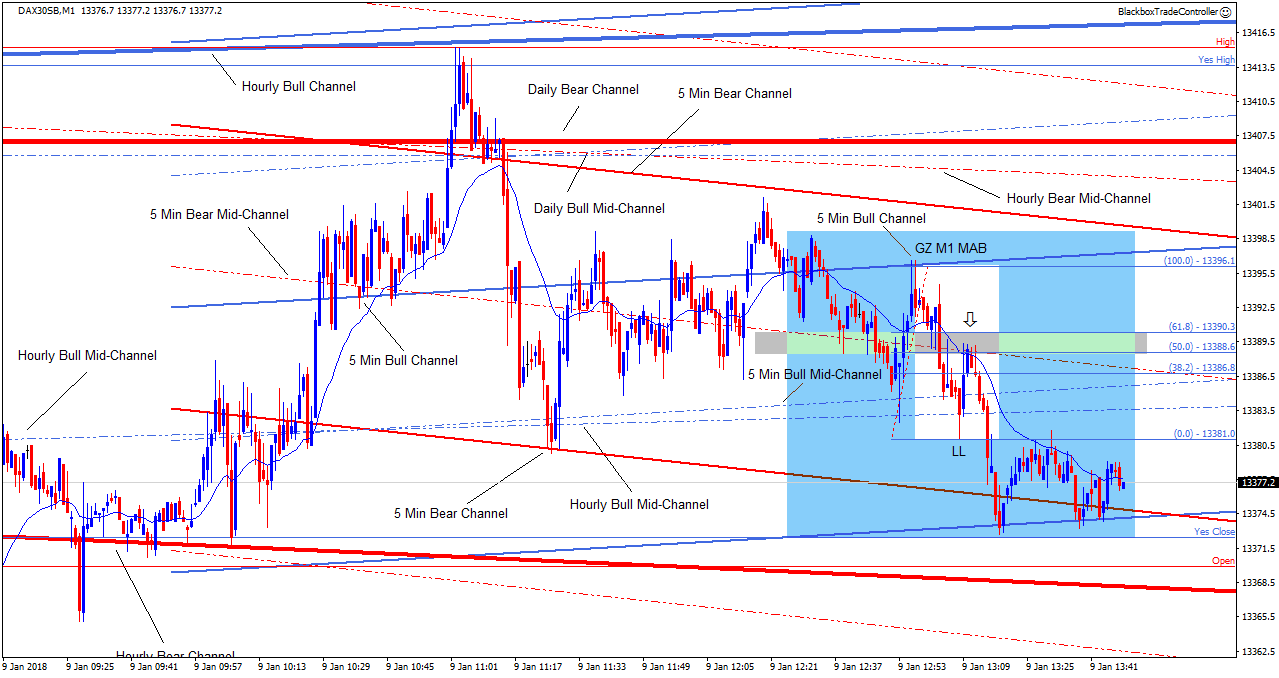
This demonstrated to us that the bull and bear channels which were defined months before were still relevant, active and very clearly capturing price. So we repeated this exercise across different time frames and markets to confirm our findings.

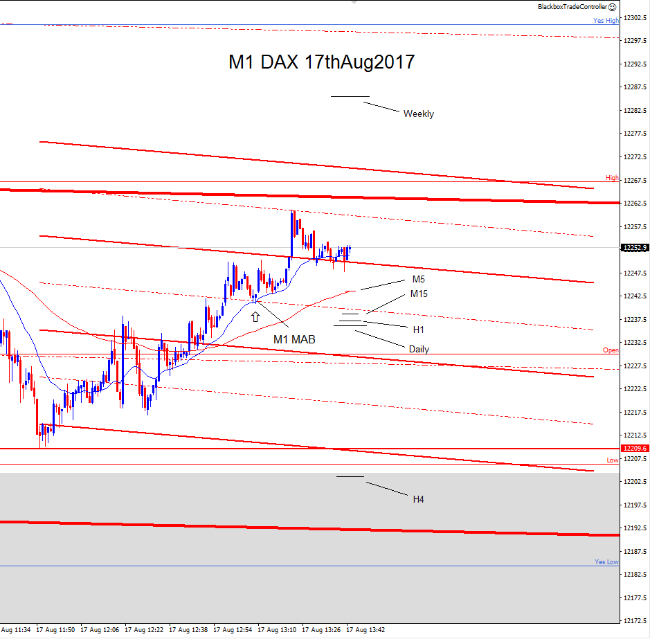
We proceeded to develop the Channels Tool to enable this fundamental sloping structure to be accurately and precisely defined for each time frame. These sloping zones or channels can be setup to display on any or all time frames according to user preference.

The user can choose to overlay any combination of these equidistant bull and bear channels onto the chart depending on which ones they decide are active and most useful at any given time. Therefore, they can be turned on or off accordingly as the user sees fit, avoiding the chart becoming cluttered and potentially confusing. When in use they can be locked into position to avoid them from being accidentally moved or deleted.

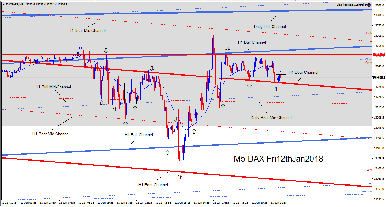
The combination of both horizontal and sloping structure make up the Price Action Grid which is a powerful tool that can be used by traders to help identify high energy, high probability, high value trade setups which often occur at grid intersections.

The addition of chart structure should be a help not a hindrance. As mentioned earlier, the challenge was to overlay both the higher and lower time frame structure onto a single chart in a meaningful, helpful way whilst avoiding the chart becoming cluttered and confusing. Therefore we leveraged the ability to install multiple versions of MT4 from the same broker and we have additional monitors dedicated to displaying the higher time frame structure of the Price Action Grid, as detailed in the section Custom Setup.

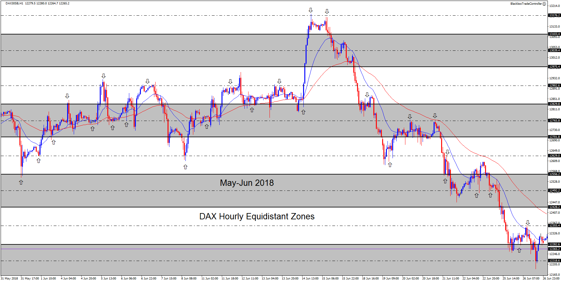
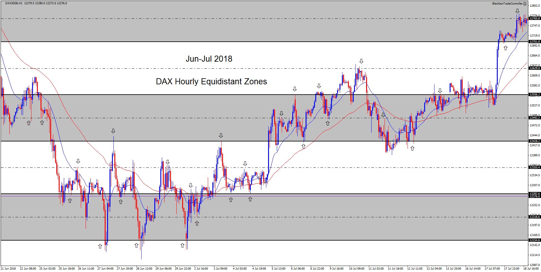
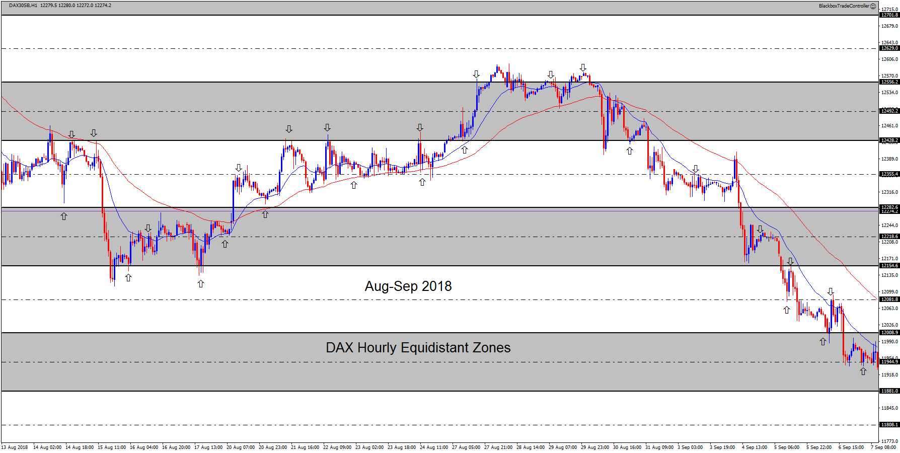
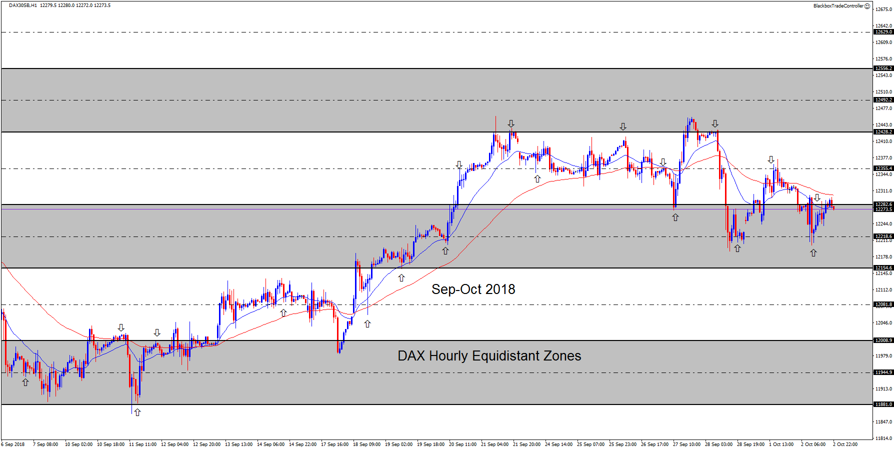
These last two screenshots show the DAX hourly time frame on the 6th October 2018, nearly 18 months on from when the hourly bull and bear reference channels were defined, with the same equidistant bull and bear channels overlaid and projected into the future.

As can be seen, they are still relevant, active and very clearly capturing price.

H1 DAX BullChannels Oct 2018
6th October 2018: Hourly Bull Channels Overlaid
H1 DAX BearChannels Oct 2018
6th October 2018: Hourly Bear Channels Overlaid

Intraday Key Levels

During our studies of intraday price movement we noticed that price regularly interacted with specific dynamic levels: – 

  • Open, High and Low of the current session
  • Previous days High and Low
  • Previous weeks High and Low
  • Previous months High and Low

So we developed the custom indicator bssIntradayKeyLevels to automatically display them on the chart.

As can be seen in this screenshot taken of the DAX, the intraday key levels interact with price, acting as additional horizontal structure and are a key component of the Price Action Grid.

Over time we noticed another dynamic level that price regularly interacted with, which we call the Session Golden Zone.

This dynamic zone is derived from the 50 to 61.8 Fibonacci retracement level from the session low to high or vice versa depending on whether price is in an uptrend or a downtrend.

Therefore we further developed the custom indicator bssIntradayKeyLevels to include this dynamic session golden zone which is automatically displayed on the chart and updated in real-time as the session unfolds.

Fibonacci Retracement Levels

When we first encountered Phi (Φ ≈ 1.618) and its reciprocal phi (φ ≈ 0.618) during our journey into the world of trading, we were fascinated by it. phi is one of the levels incorporated in the Fibonacci Retracement Tool which is used by traders to identify possible zones of support and resistance.

However, it soon became clear that chart analysis using the retracement tool often causes confusion since the marking up of Fibonacci retracement levels is very subjective and can lead to different and varied results. As a consequence of this they are often dismissed as being unreliable and irrelevant.

Our deep fascination of phi led us to study the charts in great detail to examine if and where it was in play and to determine whether it was actually relevant or not. We came to the conclusion that it was definitely in play in the price action of the charts and it forms the building blocks of price action as price makes its way up and down, therefore it is extremely relevant. 

We found that high probability trade setups occur when the Fibonacci retracement tool is used correctly and in context. The traders who dismiss or pay little attention to Fibonacci levels are overlooking an important factor in the price action of the charts.

In our experience, the 61.8 FIB retracement level which is known as the ‘Golden-Ratio’ is the most powerful. In fact we have found that the 50 to 61.8 retracement level or ‘Golden Zone’ often produces high energy, high value trade setups when it is confluent with other components of the Price Action Grid. This led us to define and characterize the FIBCON chart pattern which is a key component incorporated in the Blackbox Trading Edge.

Therefore the challenge for us as traders is to understand how to use the Fibonacci retracement tool to accurately identify the current FIB levels that are in play and correctly mark them up on our charts so that we can use them in conjunction with the other components of the Price Action Grid to help identify potential high probability trade opportunities.

Since traders and computers make decisions based upon Fibonacci retracement levels this is reason enough to include them in your trading arsenal. 

21 Period Exponential Moving Average

Traders use many different forms of moving averages and they have been a common feature in the majority of the trading systems we have evaluated. Strictly speaking they are classed as indicators and although we have stated that pure price action does not involve any indicators, after many hours of real-time chart analysis we concluded that there is something very unique about the 21 period exponential moving average.

When you witness the 21 period EMA acting as dynamic support or resistance across all chart time frames you will want it in your trading arsenal. It also happens to be the 8th number in the Fibonacci sequence.

So we developed a custom indicator called bssMALevels 
to automatically display the 21 EMA for each time frame on all charts.

The moving average for the chart time frame being viewed is displayed in blue and the moving average for the time frame above is displayed in red, in the normal way. The moving averages for the other time frames are represented using short black horizontal lines of varying lengths, the longer the line the higher the time frame it represents. This can be seen in the screenshot opposite.

Each moving average has its own energetic value and can individually act as dynamic support or resistance but when they converge they have the potential to significantly influence price.

The screenshot below shows a great example of ‘Moving Average Convergence’. The resulting bull spike happened about 45 minutes after the screenshot opposite.

The ‘ECB Monetary Policy Meeting Accounts’ were due to be released at 12.30pm.

This is a medium impact news announcement and the European markets often go into a holding pattern while waiting for the release.

Just before the announcement the M15, H1 and Daily EMAs converged. Price was supported by the M5 bear mid-channel line.

When the announcement was made, energy was released resulting in the bull spike.

Price moved up very strongly with enough energy to pass through two M5 bear channels and cross into the H1 bear channel above.

When price reached the top of the 2nd M5 bear channel which was confluent with the Weekly EMA, it reversed.

Notice how well the Price Action Grid structure has captured price!

Please be aware, we are not advising you trade such setups, in fact quite the opposite, you should completely avoid trading leading up to and during news announcements, since price reaction to them is extremely unpredictable!

In addition, it’s important to understand that a ‘Moving Average Convergence’ is not the same as a ‘Moving Average Crossover’. 

‘Moving Average Crossover’ systems are based on two or more moving averages crossing over each other. The point at which they crossover acts as a signal to enter a trade either on its own or in confluence with other signals. We evaluated such systems and found them to be unreliable, the obvious problem with them is that they can lag price considerably which means by the time you’ve entered a trade the best part of the move is often over.

‘Moving Average Crossover’ systems result in you arriving late to the party!

The Moving Average Bounce or MAB chart pattern is one of components at the heart of the Blackbox Trading Edge.

Putting It All Together...

All of the support and resistance components identified and detailed above combine to form the Price Action Grid, which as mentioned previously, can be used to help anticipate and identify potential high energy, high probability, high value trade setups.

Here are some screenshots that demonstrate the power of the Price Action Grid when it is overlaid onto both the higher and lower time frames. We think you’ll agree that it brings some clarity and order to what would otherwise look like random noise.

DAX 4 Hour Chart
DAX 4 Hour Chart with Daily Bull & Bear Channels Overlaid
M15 No Grid
DAX 15 Minute Chart
M15 Daily+Hourly
DAX 15 Minute Chart with Daily and Hourly Bull & Bear Channels Overlaid
M5 No Grid
DAX 5 Minute Chart
M5 Daily Hourly Overlay
DAX 5 Minute Chart with Daily and Hourly Bull & Bear Channels Overlaid
M1 No Grid
DAX 1 Minute Chart
DAX 1 Minute Chart with Daily, Hourly and 5 Minute Bull & Bear Channels Overlaid

And finally, this last screenshot highlights the price action that played out in the following 90 minutes after the screenshot above.

It demonstrates how well the Grid structure continued to capture price and it also shows an excellent ‘Golden Zone’ M1 MAB that formed as price made its way down through the Grid to Yesterdays Close intraday level.

M1 Daily+Hourly+M5 3

Holy Grid?...

In trading there is no such thing as the ‘Holy Grail’ and anyone who claims there is, is no trader. However, maybe there IS a ‘Holy Grid’ that when overlaid onto the chart illuminates the path that price takes as it makes its way up and down, guiding traders through the minefield of uncertainty.

Holy Grail